Video Tutorial – Build the Ultimate Responsive Menu for Adobe Muse
Build fully responsive, awesome Adobe Muse menus
Share this post
Leave a Reply
You must be logged in to post a comment.
Build fully responsive, awesome Adobe Muse menus
Elite Adobe Muse Themes, Widgets, Tuts & more... Creators of Best-selling Adobe Muse templates and Muse widgets. MuseShop.net is raising the bar in Muse design with awesome new products.
You must be logged in to post a comment.

Awesome sweeping thumbnail hover effect for Adobe Muse (more…) read more

Create a real dynamic online store in Muse with ease (more…) read more
Install thousands of vector icons for you Muse projects (more…) read more

Insert any SoundCloud track into Adobe Muse and style the player (more…) read more

Turn any Muse numbers into counter animations (more…) read more

Easily create custom responsive height portfolio thumbnails (more…) read more

How to properly organize your content in layers in Muse (more…) read more

Create custom parallax effects on images in Muse responsive (more…) read more

Make a before and after effect that reveals either before or the after image (more…) read more

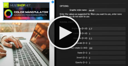
Edit color effects to images directly in Muse. Apply hue, saturation and more and create your own effects. (more…) read more

Comments (21)
Nice widget, is there a way to have the logo link to the home page?
Hi Thomas,
Thank you and yes! you can draw a transparent rectangle over where your logo is and link it to the homepage. Just make it not responsive and pin it to the top left ( see this image http://prntscr.com/e3bjq7 )
Oh I didn’t think of that, thank you for your help and quick reply!
Glad to be of assistance 🙂
Hi,
Can we change the ” cart ” icon to ” phone ”, for example with Font Awesome, change the color of the ” phone ” and keep the circle effect as shows in demos ?
If yes, how ?
Hi Maxime-Julien,
Yes, you can change the icon and color (except the hover state color). This icon is placed using Icon Font. So to edit colors, think of that icon as a text frame and edit the color of the icon sign in the text menu and fill in the fill menu. To change the icon itself use the “Glyphs” menu. See our icon fonts tutorial for more about the glyphs menu.
Hi,
I’m still unable to change the cart icon AND keeping the green circle around it. When I change the glyph in glyph menu, the circle around the icon disparred…
Can you help me with your screenshot ?
problem solved !
http://prnt.sc/eluelm
http://prnt.sc/eluf1d
http://prnt.sc/elufle
http://prnt.sc/elug13
http://prnt.sc/elugkh
http://prnt.sc/elugw4
Trying to fix a problem with the widget in the darkwell template. Changed text hover color in both states and still showing the old color. Any ideas?
How do you get rid of the submenus in the mobile menu? I only have one top level menu page with a child page. It looks silly to have the sprite on the side for menu items without submenus.
Hi Lauren and sorry for the delayed reply. We missed a couple of comments from late August because we were on a collective vacation.
You should copy the items from inside the accordion, then delete the accordion and paste the bare menu items inside the target area of the menu composition widget.
Hi
I am on the tablet/mobile step menu
I try to have two levels without submenus and two with submenu
– the one without submenus, I cannot take out the ‘+’ on the right side
– for the one with the submenus, how can i put a second step of submenus?
= name of the part > submenus of this part > then sub-sub menu of the part.
I have no problem for the master size’s page.
I don’t know if I am clear (my english is not great..)
Hi Ayuto,
Mobile menus can only have one level of sub-menus (no sub-sub-menus). To change the + icon you should change the sprite image (create your own) if you want to have different variations of the menu labels. This would require turning off the ‘Edit Together’ option on the accordion widget. My advice is to keep the mobile menu more simple than the desktop menu for easier navigation in less cluttered environment. And insert more on-page links. I hope this helps.
In the tutorial, you show how to create sub-menu buttons in the mobile menu, but I need to create another Main Menu button. The widget produces 5 Main Menu buttons within the mobile menu and I need 6. Feel like I should be able to figure this out. What am I missing?? Thanks in advance for our help!
Hi boxcar67, the mobile menu is a standard Muse’s accordion widget (with our custom mods). To add another main menu item simply select any of the tabs on the accordion and click the [+] sign that appears while the tab is selected, this will create another item. Remember to “copy size and position” and “text formating” to your remaining mobile breakpoints so your menu stays the same on all of them.
Setup menu per tutorial. When I preview it, the mobile menu icon disappears when I scroll up at 1000 px. What is going on and how can it be fixed?
Hi boxcar67,
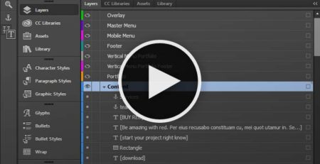
The mobile menu is hidden above the 1000px breakpoint because that’s when the desktop menu takes over. If you don’t need the desktop menu you can delete it and unhide the mobile menu on larger breakpoints. To unhide the mobile menu you should use the ‘Layers’ menu, there is a layer dedicated to the mobile menu and you can set the visibility options of its elements inside. Notice the dot on the left of each element in the layer, this is the visibility indicator and pay attention because it only works for the breakpoint you are working on and needs to be set up for each breakpoint. Also you will probably need to ‘Copy Size and Position’ and ‘Copy Text Formatting’ of the mobile menu from one of the mobile breakpoints to the large breakpoints so you don’t run into any layout issues. I hope this helps
I started a new Muse site with 60+ pages: 6 top-level, 18 sub-menus and 42 sub-sub-menus.
The site is completely empty, no content at all.
I purchased the complete package of MuseShop widgets and themes and add the responsive menu widget, following this video tutorial closely.
After inserting a new top-level button in the menu widget (“Kits & Rentals”) and trying to add menu items to it, everything goes wrong. It loses formatting as if the widget can no longer handle any more menu items. (see screenshot link). In addition, all other previous menu items suddenly display.
What is happening? Thank you for any help.
https://prnt.sc/kctdpd
Hi Chris,
This is standard Muse behavior with menus. This might sound tricky buy you need to make sure, when you are creating a new menu item that you want to have sub-menus or even sub-sub-menus, that the last menu item behind it has those sub-menus and sub-sub-menus. In other words if you are duplicating a menu item that doesn’t have those and then try to create them, Muse will generate a basic black/white unstyled sub-menu.